


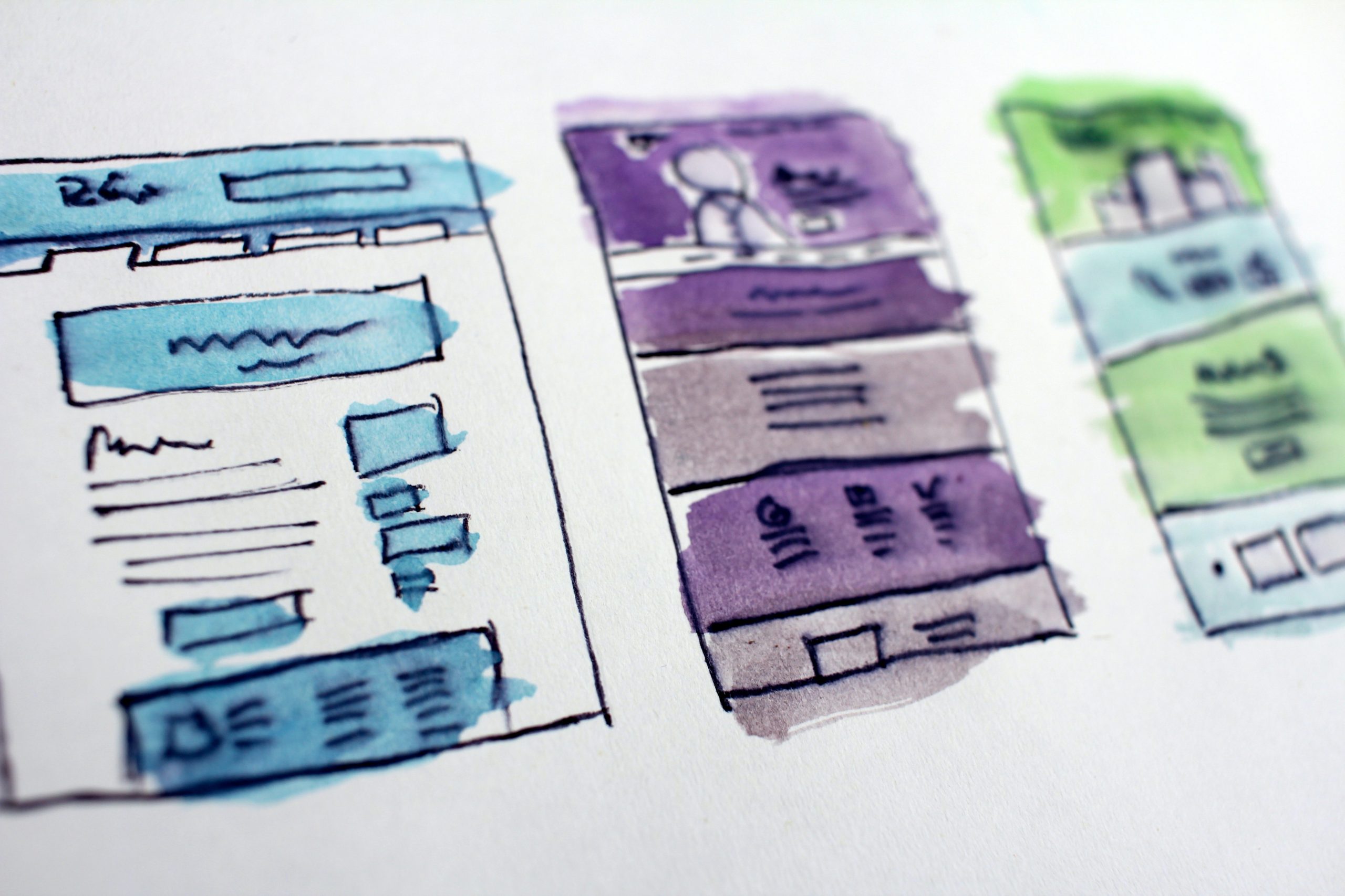
Landing pages are standalone pages on a website that are built to receive traffic from a marketing campaign. A visitor lands on the page after clicking a link in an email or an advertisement on Google, Facebook, Instagram or another social media platform.
Unlike a regular web page that encourages exploration, a landing page has only one goal. It focuses on one thing, and that is a CTA, or call to action.
Companies use landing pages to get visitors to take a specific action. That action could be signing up for a newsletter, filling out a form or making a purchase.
To attract new clients and get more out of your website, you’ll want a great landing page. But you might not know where to start, or what actually goes into one.
Luckily for you, we’ve put together this list of 6 features your landing page needs to work well.
1. A Clear, Compelling Headline
Your headline is the first thing visitors see, and you have only a few seconds to hold their attention. A good headline tells people exactly what you’re offering and why it matters to them.
Keep it short and specific. “Get a Free Website Audit in 48 Hours” works far better than “Welcome to Our Services”. If someone clicked an ad promising a discount, the headline should mention that discount straight away so they know they’re in the right place.
A supporting subheadline underneath can add a little more detail and encourage visitors to keep reading.
2. One Strong Call to Action
The call to action is the reason the landing page exists, so it needs to stand out. Use a button in a contrasting colour, put it somewhere visible without scrolling, and use wording that tells people exactly what happens next.
“Book My Free Consultation” is much more persuasive than a plain “Submit”. Action-led, first-person wording helps visitors picture themselves taking the step.
Stick to one offer. If you give visitors three or four things to choose from, many of them won’t choose any. On a longer page you can repeat the same CTA further down, but it should always point to the same action.
3. Minimal Distractions
A landing page isn’t the place for your full menu, sidebar links or a footer packed with pages. Every extra link is another way for a visitor to leave before they convert.
Remove the main navigation, keep the design clean and make sure every element on the page supports the goal. If something doesn’t help the visitor take action, take it out.
4. Benefit-Focused Copy
People don’t buy features. They buy what those features do for them. Instead of listing what your product or service includes, explain how it makes your customer’s life easier, saves them time or saves them money.
Keep paragraphs short and use bullet points so the page is easy to scan. Most visitors skim before they decide to read properly, so make the key benefits jump out.
5. Social Proof
Visitors are far more likely to trust you when they can see that other people already do. Social proof reassures them that taking action is a safe decision.
This can include:
- Customer reviews and testimonials
- Star ratings from Google or Facebook
- Logos of businesses you’ve worked with
- Case studies or results you’ve delivered
- Trust badges, awards or certifications
Use real reviews with names (and photos, if your customers are happy to share them). Genuine feedback from local customers can be especially powerful for Irish businesses.
6. Fast Loading and Mobile-Friendly Design
Most people who click your ads will be on their phone. If your landing page is slow or hard to use on a small screen, they’ll leave before it even finishes loading, and you’ll still have paid for the click.
Make sure your page loads quickly, your text is readable without zooming, your buttons are easy to tap and any forms are short and simple to fill in. Only ask for the information you really need. Every extra form field gives people another reason to give up.
Ready to Build a Landing Page That Converts?
A good landing page can make a huge difference to the results you get from your marketing. With a clear headline, one focused call to action, no distractions, benefit-driven copy, plenty of social proof and a fast, mobile-friendly design, you’ll turn far more of your visitors into leads and customers.
If you’d like help creating a landing page for your next campaign, get in touch with the team at Whelan Web Design. We’ll build you a page that’s designed to convert.
